archive magazine
editorial design / systems / photography
concept / spring 2026
Sister Magazines
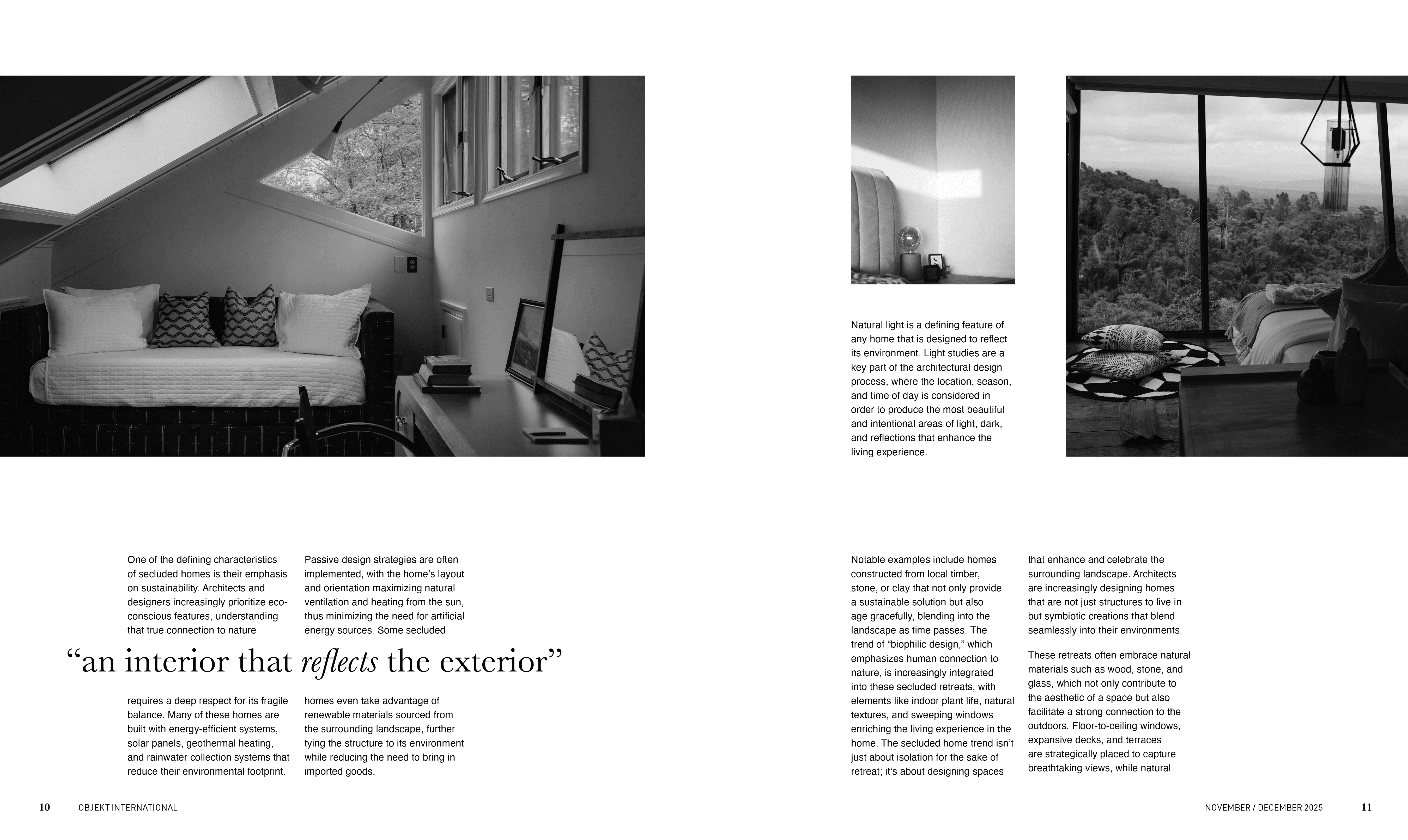
Arch•ive grounds us in reality, and looks at a smaller scale, at individual objects in our spaces, the stories that these objects hold, and how we can curate these objects and stories to create more thoughtful and beautiful spaces.
Arch•ive grounds us in reality, and looks at a smaller scale, at individual objects in our spaces, the stories that these objects hold, and how we can curate these objects and stories to create more thoughtful and beautiful spaces.
Logotype Development
Starting with a grid, I created squared off, pixelated type, then, without adding new shapes, I simply curated each letter, and carved away curves and counterforms to create the whole. The dot in the middle is meant to highlight the “arch” or the “architectural” element in the name archive.
Starting with a grid, I created squared off, pixelated type, then, without adding new shapes, I simply curated each letter, and carved away curves and counterforms to create the whole. The dot in the middle is meant to highlight the “arch” or the “architectural” element in the name archive.


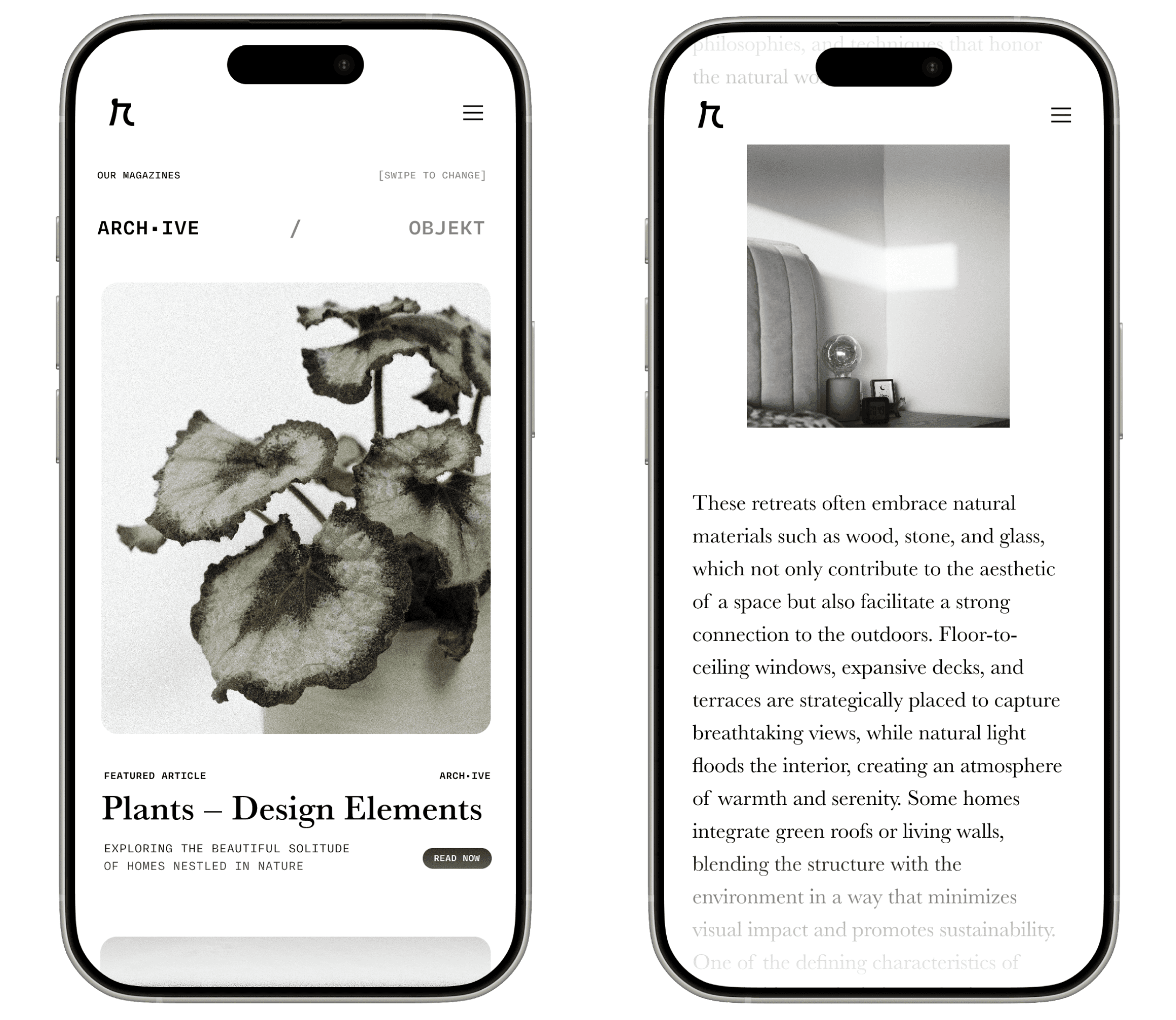
Digital & Analog Reading
Digital & Analog Reading
Without needing to order a printed magazine, readers are able to get the inspiration and knowledge to hopefully make their space more impactful while purchasing as few new items as possible.
Without needing to order a printed magazine, readers are able to get the inspiration and knowledge to hopefully make their space more impactful while purchasing as few new items as possible.

Projects
Blackboard (coming soon)
Projects
Blackboard (coming soon)