TIMELINE

6 Weeks

ROLE

Brand Designer

TEAM

Alyssa Forman

Daryl Smith

Henry Pestana

Isabella Angelucci

Jackson Stewart


TOOLS

Figma

Adobe Illustrator

Adobe Photoshop

CONTEXT

A design exhibition highlighting the 'why' behind our work.

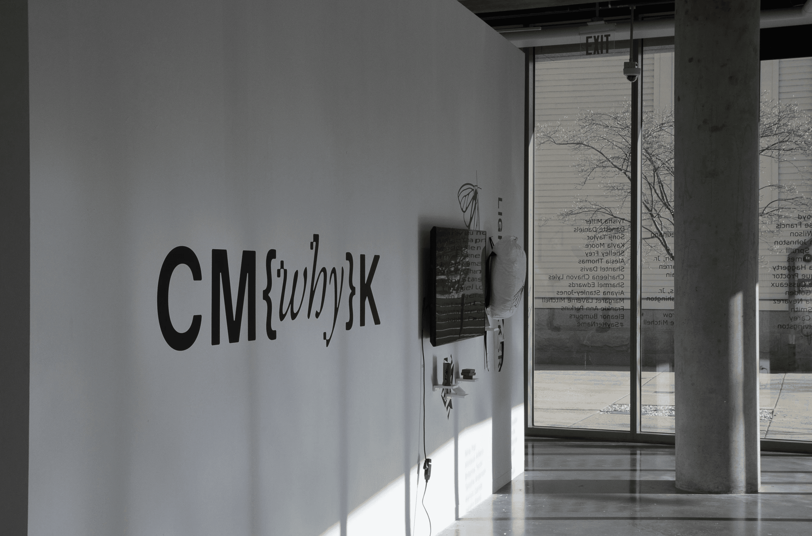
CM{why}K was the 2026 design senior exhibition at Lesley University College of Art & Design.

^ photos by Henry Pestana

KEY CONCEPT

How to represent Graphic Design and UI/UX visually?

Curvilinear shapes / halftones + pixels

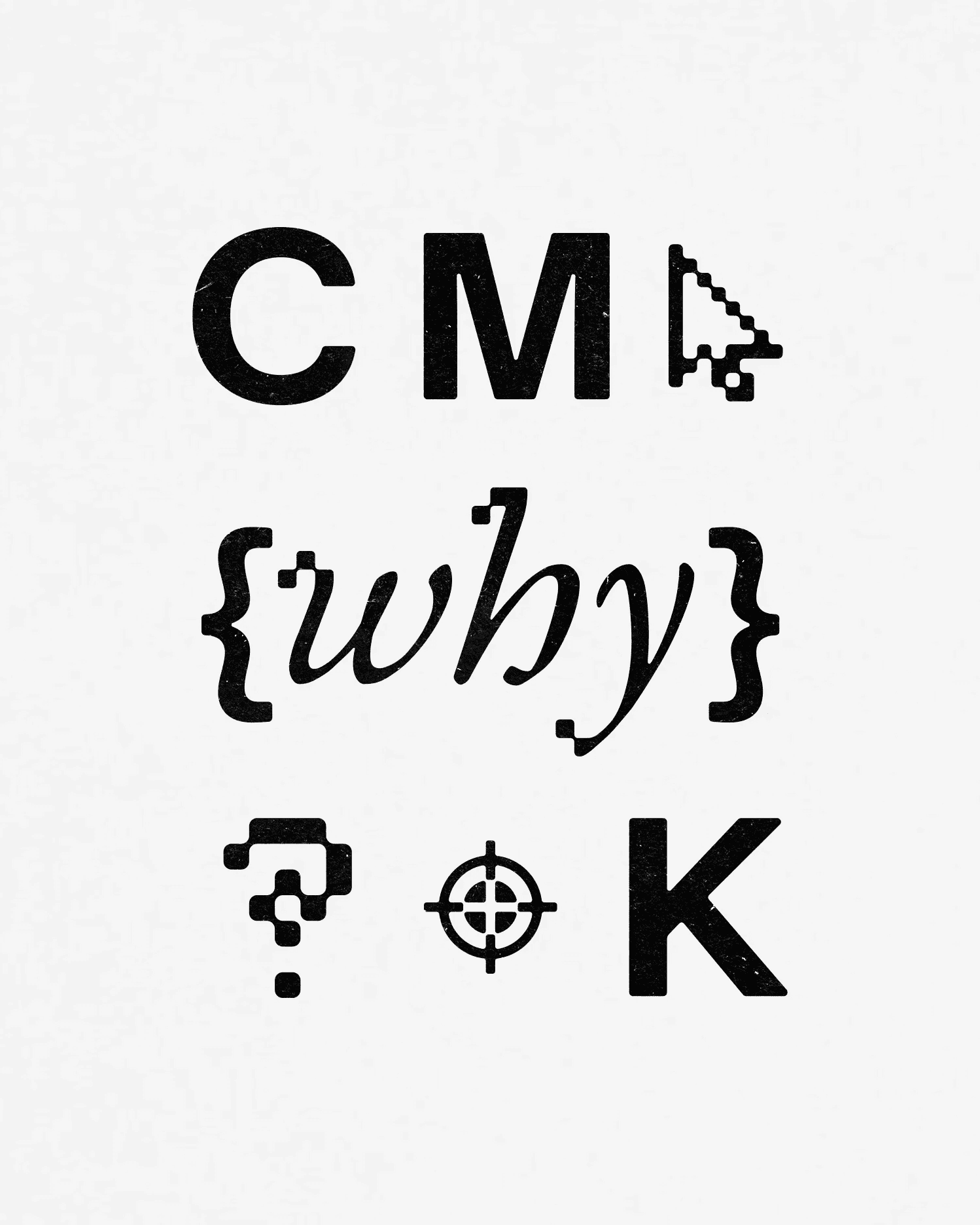
A key concept we stuck to in most of our logo ideas was a simple way of conveying that the show consists of both traditional design students and interactive design students. The answer was to put rounded corners, and elements associated with ink, like halftones and ink traps, next to pixels.

^ some explored pixel – halftone concepts

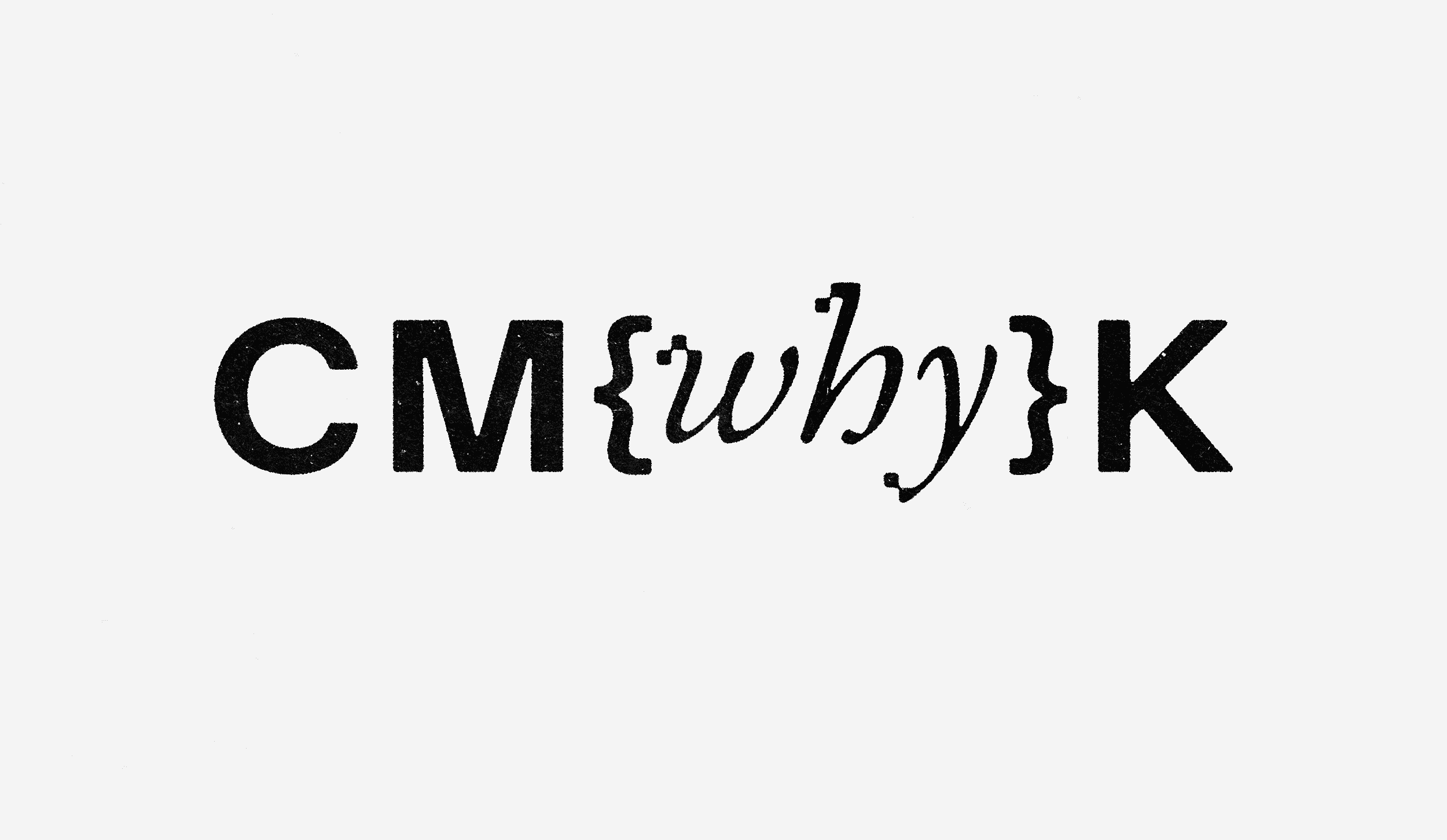
^ final "why" design

Three carefully placed pixel / halftone elements in the final design emphasize "why" by adding small details that draw the eye when seen with the simple sans serif of the "C, M, and K" and visually show the connection between print and digital that we wanted to highlight.

Three carefully placed pixel / halftone elements in the final design emphasize "why" by adding small details that draw the eye when seen with the simple sans serif of the "C, M, and K" and visually show the connection between print and digital that we wanted to highlight.

^ team logo ideation

MY CONTRIBUTION

I was chosen as a branding team leader.

As a team with three other students and our two professors, we created the branding for the exhibition. It was necessary for the branding to emphasize the "why" as well as represent the mix of Graphic Design and UI/UX students.

MY CONTRIBUTION

I created an editing workflow and image system.

We received headshot images for each student and professor. It was up to me to develop and execute an editing workflow that would match the inconsistent and sometimes low resolution images to the brands visual language.