TIMELINE
6 Weeks
ROLE
Brand Designer
TEAM
Solo
TOOLS
Figma
Adobe Illustrator
Adobe Photoshop
CONTEXT
An outdoor brand creating ultralight gear.
Lightseeker's philosophy is that of stepping lightly through nature, and seeking the light in moments big and small.


THE APPROACH
A whole identity based in lightness.
The brand is about light; both in reference to weight, and the way that we chase the sun on our adventures in nature.


LOGO PROCESS
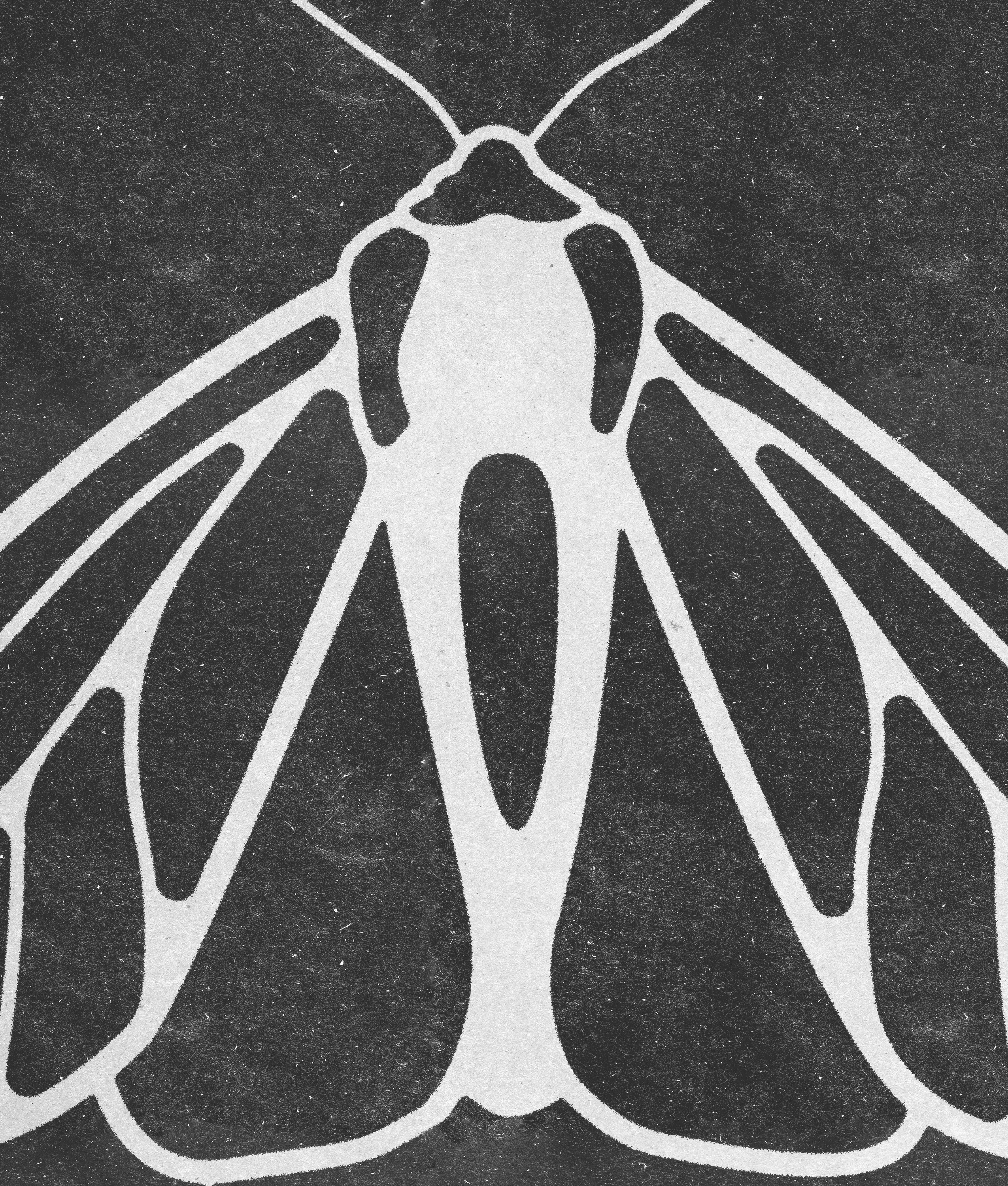
The Moth.
Moths are drawn to the light, champions of strength to weight ratios, and their shape brings to mind tents, mountains, and natural rivers and veins that create the lightweight structure of the wings.


TYPE DESIGN
A custom logotype.
I built the logotype by taking and modifying elements from multiple sans serifs, as well as creating new letterforms from scratch, like the futuristic S.





TYPOGRAPHY
I chose typefaces that represent technology and nature.
Lightseeker's high-tech products are simply a means of better experiencing nature. To reflect this in the brand's typography, rather than staying modern and high tech with Avenir, I also introduce Garamond, which contrasts the sharp sans-serif with its traditional and natural, rounded shapes.

Modern, Sharp, Technical, Precise.
Avenir provides the base for Lightseeker's typography. Important technical information, labels, and instructions are set in Avenir, such as the weight and material specs printed on the outside of every product.

Traditional, Soft, Natural, Characterful.
Garamond ensures that Lightseeker is rooted in nature and sustainability.
Things that are meant to be read slowly, and regard the brand's mission are set in Garamond, the Lightseeker Magazine for example.
COLORS
I surveyed color preferences for outdoor gear to determine product color choices.
Earth Tones
Bright, Visible Colors
Neutral / Black & White